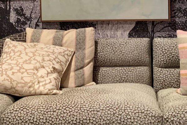
We can’t talk about contemporary Santa Fe color ideas without talking about solid Southwest colors! I’ll be honest: if someone tied my hands and said I wasn’t allowed to use a pattern in a room, I’d be totally uncomfortable! I almost always use them to bring color into a space, but that’s not what every client out there wants.
That’s why today I want to talk about a concept that’s a bit different for us at French & French, and introduce you to someone new in the process!
Solid Color
Sticking with solids is just not how my brain works! Luckily there’s another local designer who does this really well, and I’m thrilled to introduce you to Edy Keeler at Core Value Interiors.
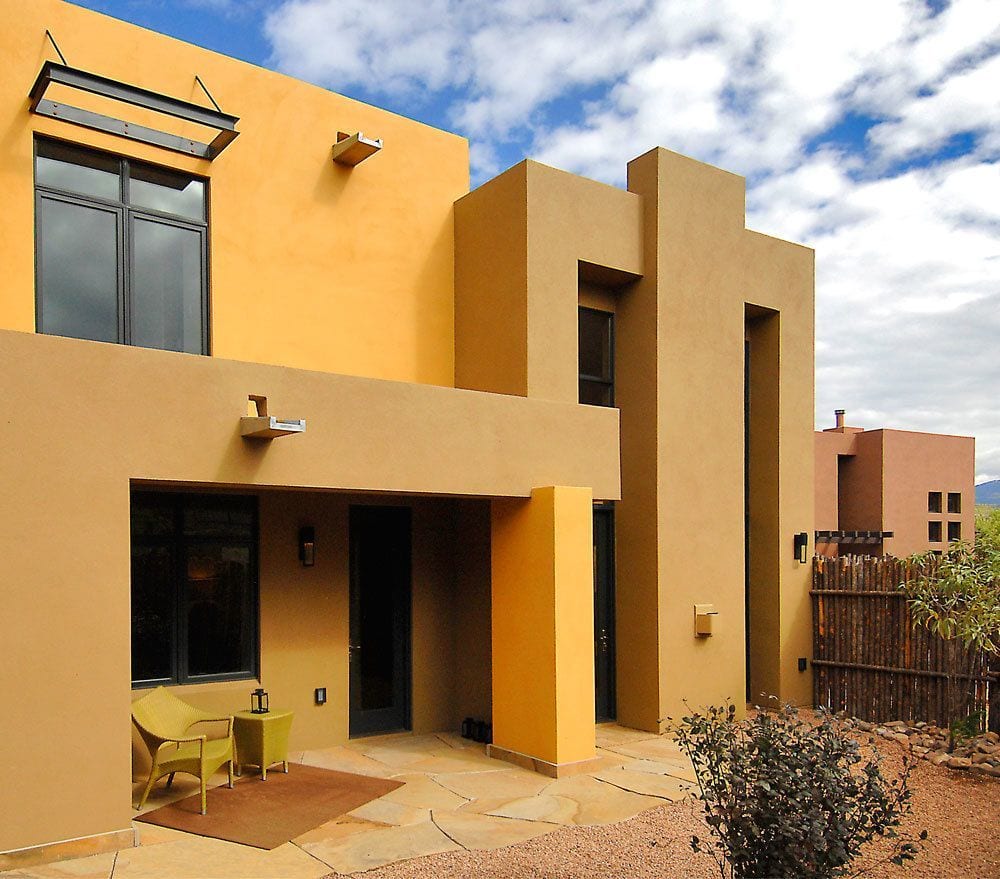
Matt and I love how well Edy uses clean lines and contemporary color blocking in her design approach, which is much more modern and minimalist than our style. This style is something only a few designers can do really well, and she’s one of the best.
This look works especially great for exteriors, which is perfect for Santa Fe! In that sense, our process is actually kind of similar — we both take some inspiration from the outdoors and our natural surroundings. But as you can see, even similar inspiration can yield completely different results depending on a designer’s personal aesthetics and their clients’ needs.
Find Your Starting Point
One thing I’ve learned from observing Edy’s work is that you still have to have a strong starting point. Just like I’ll choose a keystone fabric to use when planning out a space, you can see certain repeated themes if you know where to look.
A good place to start is by selecting something you definitely want to use in the room, and pulling a wall color from that. Perhaps a treasured piece of art, a rug, or something else that’s already in the space for you to build off of.
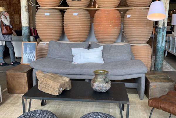
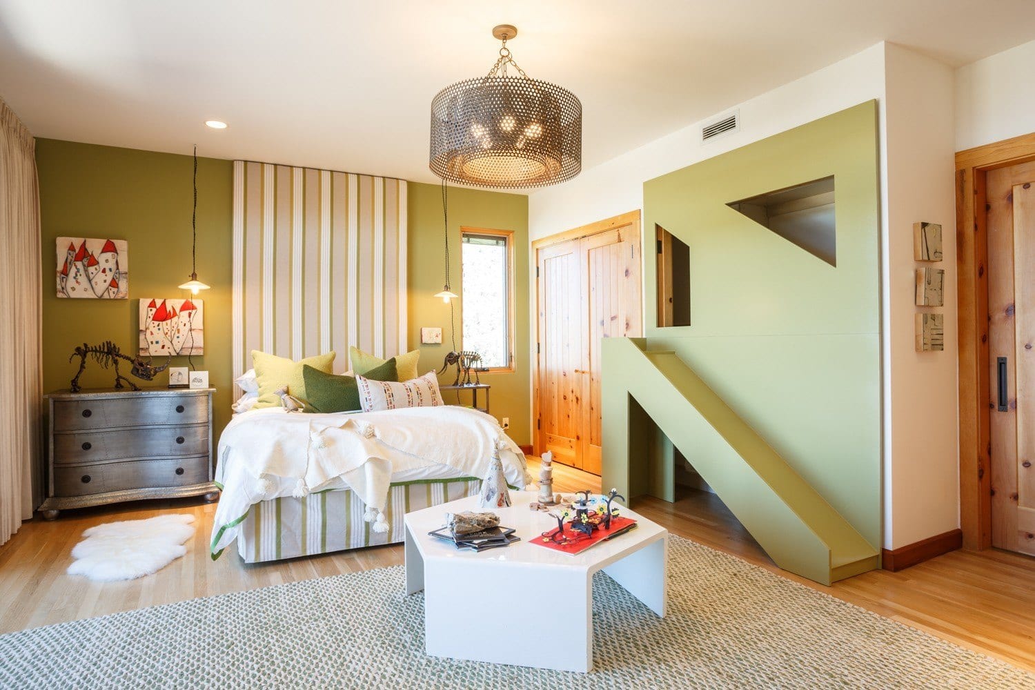
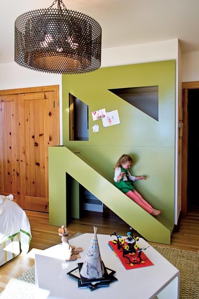
One example of this in our portfolio is the first kids’ room we did at a previous Showhouse experience. (We also love working in close proximity to Edy’s inspiration at these annual events — it’s such fun to be surrounded by great design!)
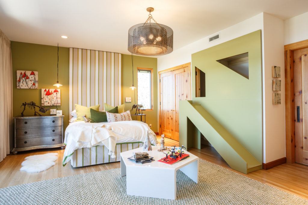
Compared to what we usually do, this room is definitely lighter on patterns! To choose the green palette, I started with this really amazing green alpaca textured fabric, and used that as a jumping off point for planning the rest of our design.
Incorporate Texture & Build Up
Texture is another thing Edy uses super well in her designs. She’ll choose different textures to keep that modern, clean look intact. This skill is so impressive to me…my brain doesn’t even think like that!!
Design by Core Value Interiors
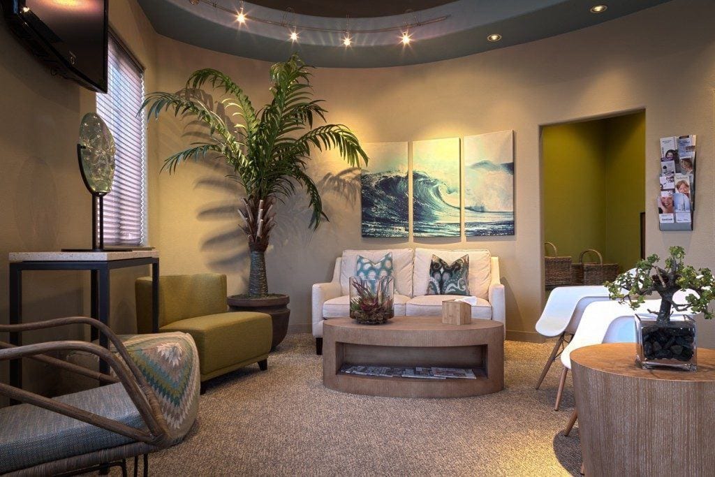
But of course, everybody’s perspective and eye is different. Edy approaches the use of contemporary color design through blocking — which is a great way to keep a style subtle but also powerful.
There’s a certain level of restraint (and a high level of skill!) to working like this. Heavy layers still have to be coordinated perfectly; even neutrals can be very powerful when combined the right way. It’s just a matter of how much you want to use!
With our clients, I’ll work to figure out what palette they’re attracted to. Do they like clean bright shades, or more muted earthy tones? A good designer will be able to get a sense of what you’re after by understanding what styles you’re attracted to — we can pull from your favorite looks and build from there.
What Edy does is pull from that base tone to find other things in the space that complement it, and then use dots, stripes and blocking to emphasize the right notes.
Design by Core Value Interiors
It’s Always a Balance
Whereas Matt and I brighten up our palette with furnishings and textiles, you can see Edy takes that to another level with some more creative paint schemes, which I just love!
Even with a dominant shade in place, there’s always a push and pull to find the right tones that relate to each other. You usually won’t see a designer matching up wall colors exactly within a palette — that can come off as too sterile. Instead, we’ll play within a range and find general matches that highlight each other.
No matter what palette you’re working with, designing with contemporary Southwest colors is always going to be unique to what you’re trying to create with a new space. The feel that’s created by the shades you use should be particular to the person and the place that it’s being designed for — that’s how you’ll know it really works!

Get more inspiration right in your inbox